UX/UI Design · Visual Design
Designing Application Icons: Tips and Tricks for Success
Application icons are often the first visual touchpoint users have with your product. Getting them right requires understanding icon types, visual language, grid systems, and production delivery standards.
Application icons are often the first visual element users encounter. On a home screen, in an app store, or in a dock, the icon represents your entire product in a single small image. Getting it right requires understanding the different types of icons, the constraints they operate under, and the design process that produces clear, memorable results.
Types of icons and when to use them
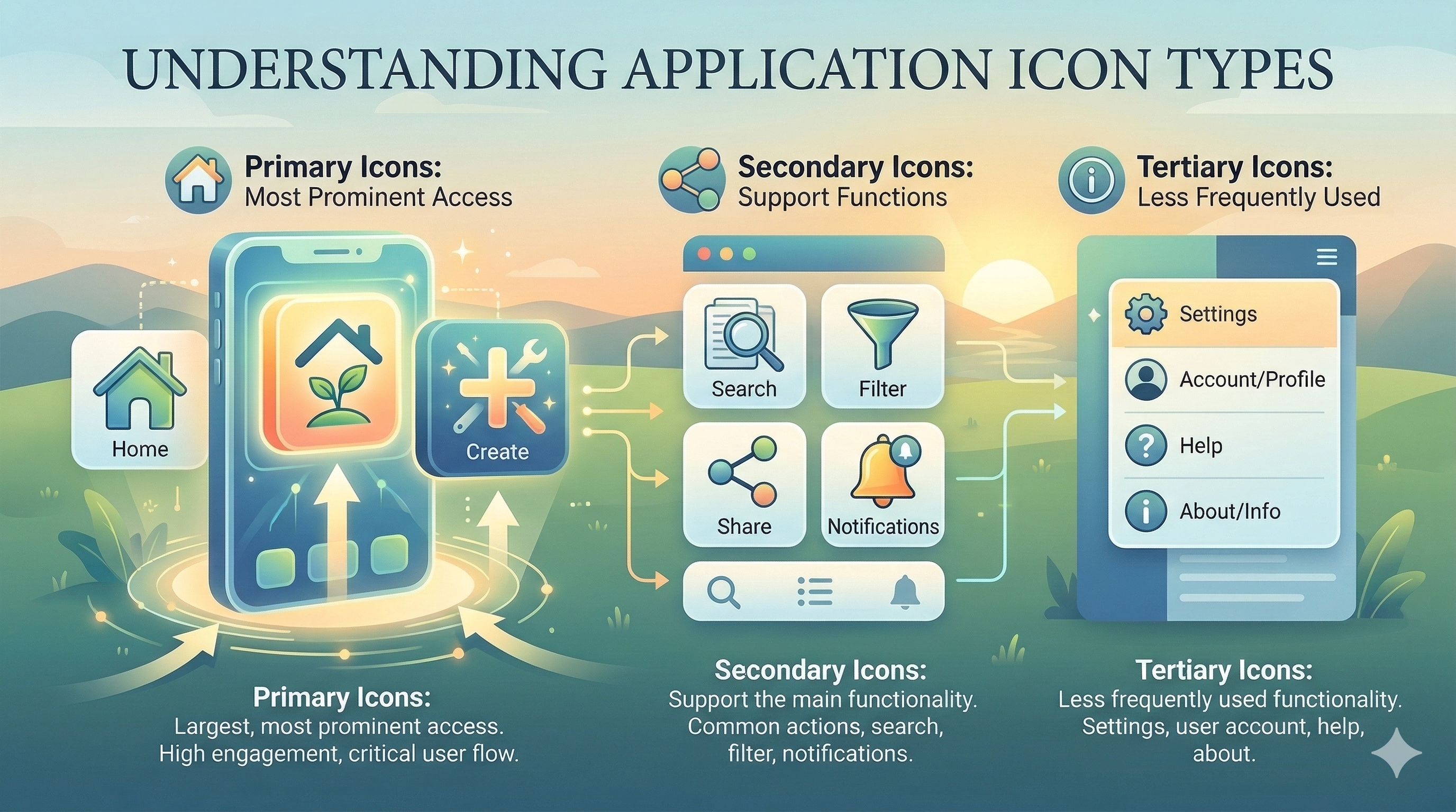
Icons fall into several categories based on their visual treatment. Outlined icons use strokes to define shapes. They feel light and modern and work well in navigation bars and toolbars. Filled icons use solid shapes. They feel bolder and more prominent, making them effective for selected states and primary actions. Flat icons use minimal detail and solid colors. Skeuomorphic icons mimic real-world objects with shadows, textures, and depth.
The choice between styles depends on context. Most modern product design favors outlined or flat icons for UI elements and more detailed, branded icons for app icons and marketing surfaces. The important thing is consistency within a product. Mixing outlined and filled icons randomly creates visual noise.
Establishing a visual language
A visual language for icons starts with defining constraints. What stroke width will you use? What corner radius? What grid size? What padding zone? These decisions create a framework that ensures every icon in your set feels cohesive. The Lucide icon set, for example, uses a consistent 24x24 grid with 2px strokes and 1px corner radii. Material Design icons use a 24dp grid with specific keyline shapes for different icon types.
Metaphor selection is the other half of visual language. Icons work because they reference familiar objects or concepts. A trash can means delete. An envelope means email. A pencil means edit. Choosing the right metaphor requires knowing your audience. What is obvious to a designer may be obscure to an accountant using enterprise software.
The sketching process
Good icon design starts with rough sketches. Draw multiple variations of the same concept quickly, exploring different metaphors, perspectives, and levels of detail. Paper sketches are faster than digital tools for this phase because they remove the temptation to refine too early.
After sketching, select the strongest concepts and move to digital. Start with basic geometric shapes: circles, squares, rectangles, and triangles. Build the icon using Boolean operations (union, subtract, intersect) to combine and cut shapes. This produces clean, mathematically precise paths that export well as SVGs.
Design tools for icon creation
Figma is the most common tool for icon design in product teams. Its vector editing tools, component system, and export capabilities handle the full workflow from creation to handoff. Figma's auto-layout and variant features make it easy to manage icons across multiple sizes and states.
Adobe Illustrator remains the gold standard for complex vector illustration. Its pen tool, pathfinder operations, and SVG export options are more powerful than Figma's for detailed work. Some designers sketch in Illustrator and then import to Figma for systematic organization and handoff.
For app icon design specifically, tools like RealFaviconGenerator handle the multi-size export requirements for iOS, Android, and web favicons. Generating icons at every required size (from 16x16 favicon to 1024x1024 App Store icon) from a single source file ensures consistency.
From concept to polished icon
The refinement process involves cleaning paths (removing unnecessary anchor points), aligning to the pixel grid (to prevent blurry rendering at small sizes), and testing at multiple sizes. An icon that looks great at 64px might be unreadable at 16px. Design for the smallest target size first, then add detail for larger sizes.
Optical adjustments matter. Circles and triangles appear smaller than squares at the same pixel dimensions, so they need to extend slightly beyond the grid boundary to look optically balanced. Horizontal and vertical strokes appear different thicknesses at the same pixel width, so some manual adjustment is necessary.
Testing and feedback
Test icons in context, not in isolation. Place them in the actual interface at the actual size. View them on different backgrounds, in different themes (light and dark), and alongside other icons in the set. Test with real users using the five-second identification test: show the icon briefly and ask what it represents.
Accessibility testing includes verifying sufficient contrast against backgrounds, providing appropriate alt text for screen readers, and ensuring touch targets are at least 44x44 pixels on mobile. Icons used as buttons must have accessible names, either through visible labels or ARIA attributes.
Production delivery
SVG is the standard format for web and application icons. Optimize SVGs with SVGO to remove metadata, simplify paths, and reduce file size. Provide icons as individual SVG files and as a sprite sheet or icon font for projects that prefer bundled delivery.
Document your icon library with a searchable catalog that shows each icon with its name, usage guidelines, and available variants. Figma libraries and tools like Storybook make this straightforward. A well-documented icon system reduces the chance of teams creating duplicate or inconsistent icons.
Chris McGuire is a product, UX, and engineering leader with 20+ years of experience building systems that bridge user needs, design rigor, and software delivery. He writes about frontend engineering, UX design, and product execution at paguire.com.