UX/UI Design · Iconography
Custom Icons and User Interface Design: Tips and Methods
Custom icons reinforce brand identity, improve usability, and create visual consistency across your product. Here is how to design icons that work at every scale and context.
Icons are one of the smallest elements in a user interface and one of the most powerful. A well-designed icon communicates function instantly, reinforces brand identity, and reduces the need for text labels. A poorly designed icon confuses users and clutters the interface.
Why custom icons matter for brand identity
Generic icon libraries like Font Awesome and Material Icons solve a lot of problems quickly. They are standardized, well-tested, and free. But they also look like every other product that uses them. When every competitor uses the same icons, the visual language becomes invisible.
Custom icons give your product a distinct visual voice. They align with your brand's weight, style, and personality in ways that off-the-shelf libraries cannot. A fintech application might use precise, geometric icons with thin strokes. A creative tool might use rounder, more playful forms. That visual consistency across every icon in your product builds subconscious recognition and trust.
Core design principles for icons
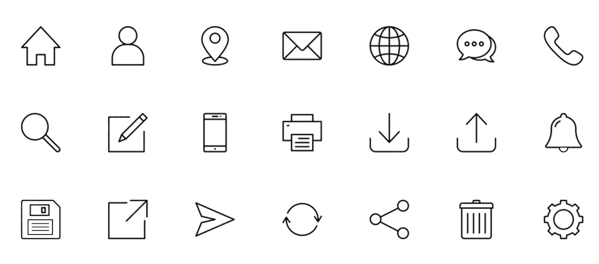
Effective icons follow a few consistent principles. Clarity means the icon communicates its purpose without ambiguity. A magnifying glass means search. A gear means settings. Novelty for its own sake creates confusion. Simplicity means removing detail until only the essential shape remains. Icons render at 16px, 24px, and 32px. Fine detail disappears at small sizes.
Consistency means every icon in a set shares the same stroke width, corner radius, padding, and visual weight. Mixing styles (outlined and filled, thick and thin) within a single interface creates visual noise. Grid systems help enforce this. Most icon sets use a base grid of 24x24 or 32x32 pixels with consistent padding zones.
Building a consistent icon system
A good icon system starts with a design token layer: stroke width, corner radius, padding, and optical sizing rules. These tokens ensure that every new icon fits seamlessly with existing ones. They also make it easier to maintain the system as the product grows.
Naming conventions matter too. Icons should use clear, descriptive names that match their function rather than their visual form. "arrow-right" is better than "chevron-caret-v2." Consistent naming reduces confusion for both designers and developers.
Tools for icon design
Figma has become the standard for icon design in product teams. Its component and variant system lets designers build scalable icon libraries with multiple sizes, states, and themes. Adobe Illustrator remains strong for complex vector work and SVG export. Sketch is still used in some teams. Specialized tools like IconJar help manage large icon libraries.
For production delivery, SVG is the format that matters. SVGs are resolution-independent, style-able with CSS, animatable, and small in file size when optimized. Tools like SVGO strip unnecessary metadata and reduce file size. Icon fonts (like Font Awesome) are falling out of favor because SVGs offer more flexibility and better accessibility.
Bespoke vs pre-made: making the right call
The decision between custom and off-the-shelf icons depends on context. For internal tools, admin panels, and early-stage prototypes, pre-made libraries are the right call. They save time and they work. For consumer-facing products where brand differentiation matters, custom icons are worth the investment.
A hybrid approach works well for most teams. Use a base library (Lucide, Heroicons, or Phosphor) for standard UI metaphors like search, settings, and navigation. Create custom icons for product-specific concepts, brand moments, and marketing surfaces. This gives you speed where it matters and personality where it counts.
Testing icons with real users
Icons that make sense to designers do not always make sense to users. The five-second test is a simple validation method: show users an icon for five seconds, then ask them what it represents. If more than 80% of testers identify the correct meaning, the icon works. If not, iterate.
Pair icons with text labels whenever possible, especially for navigation and primary actions. Text labels eliminate ambiguity and improve accessibility. Icon-only interfaces look clean but perform worse in usability testing across almost every study.
Chris McGuire is a product, UX, and engineering leader with 20+ years of experience building systems that bridge user needs, design rigor, and software delivery. He writes about frontend engineering, UX design, and product execution at paguire.com.